Tuesday 20 November 2012

Text and Image

As a visual communicator text and imagery are very important aspects to consider in design, as together they communicate a meaningful message. With the use of text added to an imagery helps give the photograph a deeper meaning. Without the use of text integrated into the photographs, you're left in suspense making presumptions of the imagery not knowing the true meaning.  The use of text helps amplify the message your trying to communicate to viewers. 


http://www.tate.org.uk/art/artworks/wearing-i-have-been-certified-as-mildly-insane-p78352


Gillian Wearing has a collection of photographs of people with  'Signs that say what you want them to say and not Signs that say what someone else wants you to say'. What I find so intriguing about these collection of photographs, is that she hasn't forced the public to write what she would like to photograph, she has let them write whatever thoughts or feelings their going through at that current time, making the text true and meaningful.

People make presumptions of people by the way they look and present them selves. The way Gillian Wearing has let the public write what their thinking makes you realise how many times we miss judge people by looking at someone.

With the photograph above of Gillian Wearing's work, without the text you would think this person is an ordinary man. The note saying 'I have been certified as mildly insane', gives you an indication this gentleman may suffer with mental health issues. With the use of the notes written by the person, helps you gain a true insight to the gentleman's character and personality.

With photography and imagery combined the text is not always true, sometimes text is used to make you see a photograph in a different light, than what it actually is to make it more intriguing and fascinating.


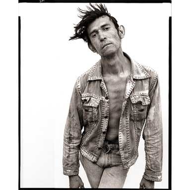
http://anthonylukephotography.blogspot.co.uk/2011/04/photographer-profile-richard-avedon.html

With Richard Avedon's work there's no text giving you an indication about the person that's being photographed, all you have to go by is your own instinct making presumptions of this gentleman. I believe this is why text works much better with imagery, as it helps prevents the intentional message from getting lost. However sometimes the photograph will have no text, as the intention is for readers to interpret the photograph in their own way, leaving viewers in suspense.

The Experts


As a graphic designer there are many practitioners that are inspirational towards my work, however Si Scott's illustrations and designs, has to be the work I admire the most.  


http://www.siscottstudio.com/

What I profoundly love about his work, is the amount of detail that's applied to the distinct shapes, that are moulded together to create an image with such precision. 

The way the shapes are in all kinds of different shapes and  forms, sometimes adds a sense of movement and life too the designs. 

With Si Scott's visuals, you can see he has developed his own style throughout all of his work from always making his designs consist of the bold distinct shapes in some form and manner. 

What makes Si Scott such an expert as a visual communicator, is the amount of detail ejected into his designs. By consistently applying his own style towards text, imagery and illustration builds up a strong identity of his visual work making you aware it's Si Scott's designs. 

For me, having your own style and being recognised for the way you articulate elements in your visuals, is an ambition of mine, which is why I have selected Si Scott to be my favourite expert.

Monday 19 November 2012

Essential Milestones

Here i have listed the ten key developments in the production of technology that I consider to be most beneficial to me as a graphic designer whilst creating our group magazine.


1861 - The first colour photograph by Clerk Maxwell.

For the magazine project based on Birmingham, being able to take photographs in colour, helped us capture street photography, portraying fashion elements of  the people in Birmingham. People express there self through fashion, colour is a major part of fashion, as it's a way of embracing your personality or mood, and an opportunity to be different. Without colour photographs it would be much more difficult to expose the extreme fashion in Birmingham, as colour plays a major part in creating a bold fashion statement.

1948 - Colour scanner invented by Kodak

For my experimentation on the magazine, to make some of the illustrations more meaningful and express the message further, I experimented with inks and watercolour, which I scanned in using a colour scanner. Without a colour scanner this would have limited by creativeness, and restricted what I can do with my magazine.

1971 - Email invented by Ray Tomlinson 

Email is a great way of communication with fellow students in the group, as well as sharing ideas, and discussing different notions further. However this type of communication benefited me most for my magazine when i wanted to make contact with creatives, to set up interviews and find out more about their style and way of working.

1987 - Adobe Illustrator launched 

For some of the content in our group magazine project, Illustrator has had a huge impact on helping create a style for some of the illustrations, giving the design a clean cut edge, to make them more appealing towards the target audience. With Illustrator it lets you create illustrations in your own way, and make render the art work if you wish to develop the design further.

1990 - Adobe Photoshop launched

Photoshop plays a major part in the development of the magazine, by enhancing the use of colour in photography and illustration, as well as the overall visual image for the content. Using different filters and affects gives me the opportunity to create a mood, or express a message further. With all the different design tools, it provides me with freedom to render, edit and create powerful content to my audiences taste. 

1993 - Adobe Acrobat launched

Adobe Acrobat is software that helps you convert other formats into PDF files, that can be accessible from all computers such as Windows and Macs. This is a necessity when doing the magazine, otherwise I wouldn't of been able to convert the InDesign file into a PDF format to publish on ISSUU. 

1996 - Internet Explorer released by Microsoft 

The use of the Internet, has been a major way of being able to research practitioners that are contemporary and historical, to help develop and influence my work. It has also made me aware of what is already on the market, so I can differentiate my magazine from competitors. As our group magazine will be published online, this is a key development for technology, as without the internet the target audience wouldn't be able to view the magazine.

1999 - Adobe InDesign and PressReady launched

Without the software of InDesign, I wouldn't be able to produce a magazine publication. With InDesign being a publishing application, it's essential I use this software when creating a magazine to deliver a high quality standard. It also gives you the opportunity to import Photoshop and Illustrator files, so you can have all different formats combined together in InDesign.

2006 - Apple start using Intel chips

When Apple started using Intel chip processors, it made the software and programs run much faster and smoothly. As I use multiple software to help develop my design work for the magazine, the Intel processor is a major part that helps me multitask and get my design work done much quicker. The development in Intel processors has enabled them to provide turbo boost technology in the latest Intel chips, which automatically speeds up your computer when you need extra performance, this handles complex software and makes it run much faster benefiting me as a graphic designer.

2008 - PDF version 1.7 becomes an official ISO standard (ISO 32000)

As the magazine is going to be published on ISSUU, i need to convert my magazine into a PDF format on InDesign, in order to upload the magazine onto ISSUU. Online advertising is a great way to connect to my particular target audience, without being able to convert my magazine into a PDF I would be restricted choosing what format to deliver the group magazine, as I wouldn't be able to communicate with viewers through the internet online.


Delivery

Different types of platforms are selected by creatives, to enhance the communication with the target audience. Delivering the message on the most suitable and appropriate platform, will increase the chance of your target audience viewing your design. 

There's such a diversity of delivery methods to choose from, however only particular platforms will connect with certain audiences, for instance if you was going to consider creating an app to deliver the message, you need to be aware if your target audience use apps and have the technology to access them. Therefore it's essential to be aware of what platform will be most appropriate and effective.


http://jonburgerman.com/work/groundbreak-nyc

Jon Burgerman was commissioned to create a mural on the pavement of Manhattan, New York City. This is such an interesting choice of format, as practitioners use conventional formats such as galleries or exhibitions. Having the art work in such a large format in a public place is really affective, as people are in the streets constantly, the strong contrast of colours makes it impossible to not recognise the art work, when your casually walking down the street. I believe this is a fresh new approach of getting your work recognised as an illustrator. By delivering your work as a mural in the streets, is a brilliant way of making people aware of your illustrations, as i this is a massive opportunity to promote your self as a creative, because people are constantly going to see it when walking down the street. Having your artwork displayed in an interesting format, communicates to the public that you're a creative person.


http://www.davidcarsondesign.com/

Different Practitioners will think of different ways they can express their work that will be most appropriate to their audience, so it amplifies communication. To maintain delivering your message to your target audience, you have to adapt and embrace new forms or media and technology, as it continuously changes. David Carson is a creative who has carefully considered the variety of  platforms he can choose to deliver his work,  and has made adaptations for the way you view his work on an Ipad, giving you the capability to zoom by pinching the screen, enlarging parts of the work that the audience find particularly interesting, so they can see the detail of work. For the format of an ipad, you can see David Carson has carefully considered the composition and layout of his work, showing a vast variety of designs to give the target audience a taste of what the typographer has to offer.

Interpretation


The interpretation of a subject is dramatically influenced by the time and place it was created. Cultural surroundings and the use of Childhood experiences will have an impact on how you interpret design.


http://bibliodyssey.blogspot.co.uk/2008/11/original-winnie-pooh-drawings.html


Winnie The Pooh, was first created by A.A Milne, and illustrated by E.H Shepard. The influence of the story for Winnie The Pooh, was watching his son, Christopher Robin play. His son's childhood became one of the most biggest influences on his work, showing that your surroundings do have an impact on your work.

The illustrations for the books done by E.H Shepard on Winnie The Pooh from 1926, with the lack of colour in the illustrations, just being done solely in black and white, indicates that the illustrations are historically influenced, as colour wasn't commonly used in illustrations in that era.  The hand drawn illustrations also highlight this is not a contemporary piece. As usually hand drawn illustrations are put onto computers and modified, to be most effective.


http://collider.com/walt-disney-animation-announces-new-winnie-the-pooh-movie/7282/

With the interpretation of Winnie The Pooh animated from Walt Disney,  in comparison to E.H Shepard's illustrations, the visual look of the characters have developed and changed dramatically. The illustrations have been interpreted differently due the different period, they are responding to a different time in design. To make the illustrations appeal and engage with children in this modern era, the use of vibrant colours makes the characters much richer in colour giving a sense of being more playful.

Another major change into the design of Winnie the Pooh characters, is the clean cut lines used, making  the characters features much more simplified, in a way making the features more memorable, due to the clarity of the design. The way Walt Disney characters are much more smooth edged, simplistic and showcase a variety of vibrant flat colours, making the characters much more endearing and playful. The use of technology being used a lot in the recent period of time, has influenced and help develop the characters of Winnie The Pooh.

I believe the Zeitgeist of Winnie the Pooh in this modern era, will enhance a much stronger communication with children, in comparison to E.H Shepard's illustration, because of the richness in colour will engage children more effectively, as the colours helps represent the personalities of the characters in a playful way. The simplified clean cut edges helps define the characters in a simple way, makes the characters more memorable for children.


Three Act Structure

Three Act Structure is a basic structure purely used for the organisation of films, so the structure is easily followed by viewers so they are much more engaged within the film.


http://www.movieposterdb.com/poster/60a15000

Beginning

The Beginning can be an opportunity to establish the characters in the film. With the film Taken, you develop an understanding that Liam Neeson will be the Protagonist in the film, as he takes lead of the film in certain situations, partially being the main focus, based on his particular set of skills he possesses. 

As well as being a way of introducing characters into the film, it's an indication of what the story is going to be about. With Liam Neeson's daughter going to paris, this is establishing where the plot is going to be based. The fear of his daughters safety, due to his past experiences of being a preventer, gives you an inclination that things might not go so smoothly in Paris and his fears may become his reality.  

Middle

This is where a crisis is revealed, where actions must be taken, in order to attempt to overcome an obstacle or resolve a situation. When the Father realises his daughter is about to be kidnapped in Paris, he goes to Paris relying on his particular set of skills to track down the corrupt gang who abduct women, to rescue his daughter from prostitution. During the middle act of the film, Liam Neeson does whatever it take to get closer to finding his daughter, hunting down and killing whoever gets in his way.

End 

This act is the stage of resolving the crisis or finding a solution. In Taken, after hunting down the ruthless gang and killing every single one who puts his daughter at risk, he eventually finds her and rescues his daughter, finally being in a state of equilibrium. In some endings not everything is revealed, which is referred to as a cliffhanger. This is purposely done to keep you in suspense, so your in questions about the next film, that will eventually reveal what happens in the next part of the story answering all your questions.

Developing Character


Throughout the development of character, emotion is an important aspect to be considered, as this will determine how the Hero/Villain will connect to the audience, stimulating an emotional response.  


http://antiscribe.com/2012/06/29/your-friendly-neighborhood-spider-man-the-best-and-worst-the-antiscribe-overview/


It is essential to think how you want to convey a character throughout a film to viewers, from the visual appearance, to the actions a character will react in situations. Depending on how a character behaves and acts to different situations will determine if the character is a Hero or Villain.

With Peter Parker being portrayed as an outcast, bullied by students, and struggling to confess his love for his next door neighbour, the character is percieved as an helpless unfortunate boy. To his astonishment, he had to witness the death of his uncle, the audience emphasise with this character throughout the film, as the characters lifestyle and behaviour has aroused emotion within viewers.  

With the incident of his Uncles death, for Peter, this was a moment of significance, as he will reflect on this situation for the rest of his life.  The build up to his Uncle's death, and to the astonishment the person who killed his Uncle, was the person Peter let go during a robbery, is signified as the Adrenaline Moment. An adrenaline rush full of sadness that only the character experiences, but the audience will emphasise with the character for experiencing such a dreadful event.

After the adomination given by his Uncle shortly after his death,  ' with great power, comes great responsibility '. Peter decides to use his special powers for the good, and names himself Spider Man, due to developing his special powers from the bite of a spider. Spider Man adopts the role of being the Hero in the film by making a difference and acting on crime, robberies and muggings in his city, using his powers for the good. However what defines Spider Man as the Hero, is when he uses his powers in extreme events to overcome an extraordinary obstacle,  the green goblin.


http://wegotthiscovered.com/movies/10-villains-amazing-spiderman-2/


Norman, is soon to be stereotyped as the Villain during the film, due to his emotional response after hearing the news that the weapon he's been working on with scientists is unstable, and is running out of time as he's about to loose fundings.  This drives Norman to be out of control, exposing himself to the unstable formula. The character develops special powers,  becoming split personality, between Norman, and The Green Goblin. Norman is driven insane seeking revenge out of pure anguish towards work colleagues he murders directors and competitors in the business, putting many other people at risk in the city. The Villains fatal flaw in his character, was that he couldn't accept and come to terms with being a failure, due to his weapon wasn't stable.

With the thought process of characters it will lead to a conclusion. The Green Goblin wanted partnership with Spider Man to rule the city, due to Spider Man declining his offer this lead to the Green Goblin's determination to kill spiderman, but the emotion of Spider Man gives him that slight more strength to beat The Green Goblin, protecting his City from the evil.


Sunday 11 November 2012

Tone of Voice


Tone of voice must be considered when visually communicating a message towards your audience.  The choice of typography, imagery, colour and layout are all elements that contribute towards the tone of voice. It’s essential to have the correct tone of voice, as it will help deliver a consistent message.


In Visual communication, it's important to deliver the right tone of voice through typography, to help convey a clear message. For the word 'silent' the typeface chosen contradicts the meaning of the word. 'Silent' should be displayed in a much more subtle and delicate manner, to help express the meaning of the word.


With the word 'Loud', it should be much larger and bolder, giving off a much more dramatic look, to amplify the meaning of the message, as having a relaxed delicate font, provides complication of what message is trying to be delivered.


http://www.apple.com/mac/


With Apple the tone of voice is formal through the choice of san-serif typeface and colour choices, this sophisticated house style is consistent throughout the products and branding. The branding is presented in a formal tone of voice to reflect the quality and precision of the products. Presenting a clear message of the quality of products through the tone of voice, will reach out to the middle/upper class target audience, who strive for quality and reliability in products.


http://www.thedieline.com/


The branding for 'JAFFO' has a much more informal approach as it's aimed at a younger audience. From the playful visual imagery with the colourful packaging, to the casual san-serif type face chosen, it all contributes to an informal tone of voice. The use of vibrant colour to represent different flavours makes it much more intriguing and eye-catching for children. The playful illustrations are a much easier way to connect with children instead of text, as visual imagery will engage them more into the products instead of masts of text. 

After analysing Tone of Voice, it makes me aware i need to do in depth research to the target audience, to make sure i select the right devices such as typography, colour, layout, and imagery, to deliver a message in design, that communicates with the audience in the right tone to be successful.


Legibility


In Visual communication, Legibility is a very important aspect of design, when choosing the font size for different typefaces. When considering legibility, the use of colour, typeface, imagery, and layout are factors that will determine if your text will be legible or illegible.


http://www.davidcarsondesign.com/t/


Text doesn’t have to be legible, sometimes it’s purposely done to reinforce a message that the imagery portrays, or to make it more of a challenge for viewers to decode the design and discover the meaning. David Carson is famously known for pushing boundaries and breaking rules through the use of typography by the way it's composed. 

This poster that's been designed by David Carson for a surf festival, is still successful even though the some of the typography would be considered illegible as parts of the typefaces are hard to read due to weak contrast in certain areas and overlapping text.

I personally think this poster works effectively and communicates the message to viewers, as the imagery helps give a clearer understanding with the typography what the poster is trying to convey. The composition of the layout has been balanced effectively. A visual hierarchy has being implemented, making your attention being drawn to the typography first, giving you a challenge to work out and discover the message. The surf board being placed in the centre as a clue , with the background being a natural beach location, helps give a clear indication this poster is promoting an aspect of surfing. 

The informal typefaces that have been chosen, purposely to create a playful atmosphere of fun and excitement, implying what it may feel like to surf. With the range of typefaces selected, it creates a much more friendly approach towards the poster inviting you to come to the surf film festival in Spain.


http://www.itproportal.com/2012/10/23/virgin-boasts-new-customer-record-following-bolt-farah-ad-campaign/

With Virgin's advertising campaign, a clear strong message has been delivered to promote the broadband service, through legibility and imagery. The aligned san-serif typeface being bold and clean cut, helps the typography be clear and visible, catching the public's attention.

Sometimes font sizes are chosen to give purpose or meaning. Having a particular part of text in much bolder bigger lettering, will attract more attention, but perhaps it’s intentionally done to give emphasis on the meaning of words. 

With the poster having the first few words in a much larger bolder type face, helps create a hierarchy of text. The hierarchy of text makes it easier for readers to digest the information, by being more experimental with the type size. 

The imagery of Olympic Champions Mo Farah and Usain Bolt represents what Virgin is all about, as they're dedicated to delivering fast speeds. Mo Farah implies you need to 'keep up' with virgin as there constantly doubling speeds. This strong imagery has been included with the text to reinforce the message of what virgin has to offer, and help the text become more meaningful to the public so it communicates effectively.

The advertising campaign has been so successful in getting customers to join Virgin, because the message through advertising has been communicated clearly, as the public have taken action upon it. The use of clear legible fonts against a strong contrasted background throughout the campaign, is the reason along side with the meaningful imagery, the message has connected with the public, which is why they've responded.