Wednesday, 20 March 2013

Information Design by Colette Jeffrey


“Make it simple. Make it memorable. Make it inviting to look at. Make it fun to read”
Leo Burnett, advertising executive


Information design is a way of communication to inform. It's problem solving how to make information easier for viewers to digest and understand. By simplifying information and eliminating the unnecessary, can help make an information design successful. The use of visuals, typography, colour, layout, and structure are all essential parts that contribute in creating a successful information design. If these elements are executed in a successful way to viewers, they will be enticed to read the message, due to it being simplified in a creative way that attracts viewers.
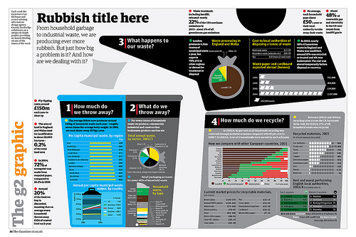
http://www.grundini.com/#!/project/the-g2-graphic/pets-6708116187

Information design can be any form of communication that's designed to inform, here is an example of an infographic by Peter Grundy. In this particular infographic Peter Grundy has designed to inform viewers about recycling for the Guardian. The creative experiments and explores different ways of communicating information in a simplified way. Visual imagery is used to represent what the piece of communication is about for viewers to understand. The use of creative graphs and bar charts are used to simplify information and statistics in a much more creative way, and prevents having columns of text. The visuals being created in such a clean cut way helps make the image clear of what it's representing. The use of colour helps make certain parts of the information more eye-catching, by having colour well balanced across the whole of the infographic, helps entice viewers to read all parts of the infographic. In all of Peter Grundy's work he has developed a consistent style by the way he illustrates his visuals, helping create a strong identity of his work.


http://www.coroflot.com/holley_codner/type-posters

Typography is also a crucial element when creating information design. Neville Brody is profoundly known for using the typeface 'Insignia' that he created. The typeface has adopted aesthetics of Art Deco, that has been given a modern twist. The legibility of a typeface is essential, as it helps viewers read the information clearer, by having such a bold clean cut type face, Insignia is widely used to communicate information due to being so legible. The use of grid structure and columns are consistently used to help break down text so it's easier to digest. The use of white space and colour in this particular visual helps create a visual hierarchy, making you read information in a particular order. 

Overall, the use of researching into information design I found most useful, as this helped me remind myself of all the different elements you can use to inform people in a creative way. I will explore all elements in the future, when i'm designing to inform, to help me create the most effective communication piece thats full of creativity. 


Great Art Direction by Ros Sinclair


In today's society we are bombarded by complexity of hundreds of communication messages, and very little are noticed. Simplicity is rare, but powerful. If a simple message is executed in a clear way that people understand, the message will be successfully received. However by delivering a simple message, you need to make sure you deliver the communication in an original way, otherwise the visual may perceived as a cliche and become boring. A successful simple message will connect to viewers on an emotional level, and gain an emotional response. 

http://theinspirationroom.com/daily/2004/volkswagen/#.UUm78s3ud8d

Throughout the Lecture Helmut Krone's advertising campaign visuals we're the most memorable piece of communication, due to how the creative stripped the idea down, making the idea obvious but powerful. The layout of the communication is what made the design so memorable, by having such an unusual layout, creates an unforgettable visual. The use of 'white space' helps draw attention to the clear message 'think small', with the car reinforcing that message in a visual way.  

The way the visual communication is composed shows Helmut Krone was a lover of Design hierarchy. By having a white background against the black typography 'think small',  creates maximum contrast making your eyes drawn to that specific part first, then the use of white space, endears viewers to the car, implying the clear message in an unusual layout. Lastly your then drawn to the information at the bottom curious why you should 'think small'. Implementing a design hierarchy in your work, helps you be in control of what information you want viewers to digest first, by delivering the clear powerful message first, will entice readers to then go on and read the information below about volkswagen.

The conventional way for advertising campaigns to communicate cars, was to have the visual image of the car taking up the majority of the page, shown in an over powering way. By Helmut Krone having such an unusual layout of the car being small with large amounts of white space, makes the layout much more intriguing and differs from competitors. Overall I feel this piece of communication amplifies a clear message in an unusual way, making this advertising campaign simple, but different.


This advertising campaign created by BBH agency in London, has recently been one of the most successful communication advertising pieces i've seen. The way the message has been visually simplified delivering the benefits of the s7 to viewers without using and image of a car makes this communication different. The use of animals to represent the two different speeds this car can achieve, amplifies the power of the car. The use of white space, colour choices, and layout are done in a highly sophisticated way reflecting the style of Audi. I believe this communication has adopted the same qualities that Helmut Krone used, by delivering a clear message in a simplified way with the use of white space and design hierarchy.  The use of white space helps put all focus on the visual image for viewers to decode the message. then the message is elaborated in typography to help reinforce the message and benefits of the Audi s7.

 By advertising for such a well known brand BBH agency knew people would recognise the brand by just the logo, which has given them the freedom to create a clear message in an unconventional way. The design is done with such clarity, delivering a simple message, in a different way. Overall I've learnt  it's about getting rid of the obvious pieces of an idea, and stripping it down to the minimum making it different, then adding a powerful clear meaning, that will captivate the viewers attention delivering memorable messages and gaining an emotional response.

'Simple but Different'

Matt Pyke by Jonny


Matt Pyke is the founder of a digital creative studio, Universal Everything. The creative explores the sensations created between abstract and figurative form of sound and visualisation developing vibrant digital artworks, resulting in major influences of life and the study of humans and their culture.

Matt Pyke was a well rounded visual communicator, as the practitioner explored many different disciplines, materials, and technologies. Matt Pyke connects with other creatives through the internet, helping him collaborate with a wide range of diverse visual communicators, has helped him push boundaries with other specialists, and develop unique responses.


Matt Pyke is motivated by the pursuit of the new, he has an optimistic mindset of what the future holds and what technology can bring. Anthropology has been the main influence in this particular communication, as the vibrant lines represent the dynamic movement of humans, and speed. The way universal everything have composed this piece, the use of sound helps bring soul into this visual. The use of colour and motion captivates your attention, finding yourself fascinated with the movement of every line.


http://www.creativereview.co.uk/cr-blog/2009/april/design-and-the-london-olympics-a-winning-combination

Universal everything, also participated in directing and producing the launch for the London 2012 Olympics logo, by bringing it to life. Through the use of animating the logo, helps represent the dynamic speed of the olympics. The combination of vibrant colours and motion brings the logo to life, helping create a vision of speed and energy represents what the 2012 Olympics was all about. 

Overall Matt Pyke (founder and director of Universal Everything) has aspired me to explore different platforms, and not be afraid to break boundaries or experiment with different materials. In order to create something memorable and unforgettable that's never been seen before, risks are essential. Matt Pyke is a pioneering creative, where his digital arts are so captivating through the use of vibrant colours and dynamic movement, the creatives visuals are so influential, it will aspire me to challenge myself across all disciplines. 


Tuesday, 26 February 2013

Inspirational work from practitioners of the Ikon and Birmingham Museum & Art Gallery


This is one of the series of visuals of 'Today's Question' by Eva Weinmayr. The use of captivating colours originally engaged me in this particular visual. Having such a clean cut design and legible typeface, the question in this visual is delivered with ease. By using an open question automatically arouses a debate within the public on personal views and opinions in the society. The advantage of using this open question in the practitioners work, will help her work become memorable by the public.  Being such a personal matter of today's questions in society, people will build an opinion on this question that will be discussed and debated with others, to voice their opinion or typically define their opinion. I believe this visual is a great way of engaging the public into your work, by imposing a question it gives viewers the opportunity to get passionately involved in a debate or a journey to figure out the answer.


This line drawing created by James O'Hanlon, is based on the skyline of Birmingham 2012. This depiction of Birmingham can be easily perceived as a sketch of Birmingham, however it was created with black paint. The panoramic view of birmingham taken from the Alpha tower, was based on his own photographs, capturing the true character of Birmingham. The use of black lines has developed a detailed visual of Birmingham, where the more you look at the painting, the more you discover. The use of black and white creating a maximum contrast, helps enhance the features and characters of Birmingham. By being done in a simplistic way from the use of not adding colour, helps create an unromantic feel towards the city, but the visual is still endearing, as there's so much to explore in this painting. 


 Justyna Ptak is particularly fascinated in house spaces. 'House 1' is a series of photographs of spaces taken by the artist. The use of close up images being framed is significantly important, as the close up images are done to intrigue viewers to consider and question a story or an experience that might exist just outside that space. In her work she explores the concept of unknown places, leaving viewers in suspense of where these particular spaces are. I admire the idea of her work being based on 'abandoned non-moments', it gives viewers the opportunity to interpret the work openly, letting your imagination run free to what stories this particular space may with held. I believe the series of photographs are every day scenes, ordinary with a placid approach. By capturing ordinary everyday scenes, her work explores the known and unknown, keeping viewers in suspense to where those spaces are, and the stories that may exist.


 Within this colour woodblock print produced by Toyochara Chikanobu,  the creative has incorporated visual popular traditional motifs that represent Japanese Art. The Carp is a symbol of good luck, and the Wisteria is a popular Japanese flower, which is also known as 'fuji' where in the history of Japan, viewing Wisteria was a popular activity. As soon as I started viewing the woodblock print I automatically made relations to Japanese Art due to the traditional elements being used. This design has been portrayed in a delicate form, embracing the tradition of Japanese Art. From looking at this visual it makes me want to explore different elements of Japanese Art, as I admire how different elements symbolise a meaning or a tradition of Japan.


This beautiful canvas was created by Fiona Rae named 'Dark Star'. This was created with acrylic, oil and coloured glitter on the canvas. The combination of different brush strokes being sprayed, dripped and marking making are all composed in a traditional landscape chinese painting way, being influenced from the practitioner's original environment, as Rae was originally from Hong Kong. The use of symbols also embraces Rae's environment. All of the different mark making and shapes symbolise her inspiration from sci-fi, comics, cinema, music, and advertising. I personally find the way Rae has interpreted what she's interested in, and developed her own style by experimenting with mark making and different brush strokes to communicate what she is personally fascinated by. The use of the shapes and symbols creates a sci-fi experience, and the shapes being sprayed and stroked in different directions almost creates a feel of motion and space by the way the design has been composed. I found Rae's work an eye opener on how to compose your notions in a completely different way,  which has made me want to explore her culture, as injecting those cultural elements into her work is what makes the work so inspiring and fresh.


At the Ikon gallery I discovered Timur Novikov's work, which I found incredibly influential. He was profoundly known for the use of fabric incorporated in his work, where he developed and created a style that was so simplistic almost childlike motifs. The two main pieces of cloth, the black part acting as the ocean, and the white part acting as the land, has been simplified in such a powerful way the visual interpretation is clear by having the scattered childlike penguins making their way to the water with a few of them caught in the action of diving in, giving that sense of motion, and portraying a visual image of what is happening. Overall the simplicity of Novikov's work will influence me to experiment in visually communicating in a simplified manner, to deliver a clear message in my future work. 

Wednesday, 20 February 2013

Design Hero's by Jane


http://www.tumblr.com/tagged/things%20i%20have%20learned%20in%20my%20life%20so%20far

Within this lecture, Jane introduced to me a creative I've never came across called Stefan Sagmeister. I felt it was an eye opener being introduced to such an experimental practitioner. In his work especially in the book 'Things I have learned', Stefan Sagmeister produced a personal typographical experiment, where there's a strong influence incorporated from the environment. With the use of personal quotes that relate to Stefan in his own personal experiences, helps evoke an emotional response from viewers, as the quotes deliver a clear message that people can relate and connect too.  Even though the quotes of the typography string together a clear message, the typography on it's own leaves an open interpretation of what the word is portraying in that particular environment. The single word within that environment intrigues you, making you make presumptions and question Stefan Sagmeister's personal experiences.

In all of the practitioners designs, especially typography, he has developed his own unique style, which has helped the creative become increasingly known by viewers. When you see design work with the same experimental visuals of typography, you begin to recognise the characteristics and make presumptions it's Stefan Sagmeister's work due to how he puts his own original personal stamp on things.   


http://www.bantjes.com

Once being introduced to Stefan Sagmeister, it made me realise the connection between a creative named Marian Bantjes. I have found some of her work incredibly influential, purely because of how she expresses the typography in a creative way to emphasise the message and meaning which I feel Stefan Sagmeister does in his own personal way. My particular favourite piece of her work was for a German magazine where she illustrated the spreads, he loves me, he loves me not. The use of colour for the 'he loves me' illustration emphasises the passion of love, and portrays an image of a woman picking off the petals of the flower trying to figure out the answer if he loves her or not. The illustration on the right above for 'he loves me not' is shown through the use of spikes representing the pain a woman may feel if she finds out he doesn't love her.  The way the words have been illustrated to express the passion and pain this person may feel, has been done in such an emotive way, this arouses feelings in viewers, as they can relate to being in this scenario of being in suspense wondering what the answer is. By arousing emotion in viewers helps create a strong connection in the poster making it memorable. 

I believe Stefan Sagmeister and Marian Bantjes go through the same process of experimenting freely to express meanings in their work, some a clear understanding and others up for an open interpretation. What makes their work so special is the way the typography has been carefully crafted in such a detailed original way, it automatically captures your attention.  


Monday, 18 February 2013

Design Hero's by Mark Murphy


'Design is thinking made visual'


http://annyas.com/screenshots/updates/saul-bass-movie-posters-storyboards/

Mark Murphy shared his most inspirational practitioners in the lecture,  helping me gain an insight to where Saul Bass gained influence to produce such creative visuals. The use of simplified shapes, block colours with a distinct colour palette are all characteristics of Saul Bass's work that have been majorly influenced from The Bauhaus movement, that changed modern design creating an era, that helped free design from ornamentation and clutter. 

The way Saul Bass takes a complicated notion and encodes the message in a simplified visual way, is why the practitioner was able to communicate such a strong successful message. Saul Bass was profoundly known for creating memorable film posters as well as branding. The film posters above have all been well composed by experimenting with the use of 'white space' to help put all viewers attention and emphasis on the semiotics for the public to decode the message. The use of colour choices for the film posters helps create a strong contrast enhancing the features of the simplified shapes.

What intrigues me the most about the creative's visuals, is the way the notions communicate a sense of speed and emotion through illustrations being simplified and clean cut. The way Saul Bass took a message and simplified it through visual communication  for the public to understand the message and digest the information successfully, will inspire me as a creative to communicate using simplified shapes to make the message clear to viewers.


http://www.behance.net/gallery/MODHO-Branding/6959883


A creative designer, called Tiago Campea uses the same design characteristics as Saul Bass. The use of clean cut simplified shapes, keeps the design simple but powerful. The branding done for Modho represents the architecture systems used for the house projects. Each 'M' is carefully constructed in a different way with distinct colour palettes emphasising the use of creative modern grid structures, to produce innovative contemporary house designs as a company. I believe Tiago Campea has cleverly portrayed what the brand is about through the use of simple shapes and imagination. With the complex 'M' structure changing into different formations, it gives off the feeling the company Modho produce creative house structure, making you intrigued what the company has to offer. 

After analysing these practitioners work, I will take forward how it's important with the use of simplified shapes and symbols, to communicate a strong message and meaning of what the brand is about or a film poster, in order for the design to be powerful and meaningful.


Another creative that Mark Murphy happened to share with us, was also one of my all time design hero's. David Carson is profoundly known for breaking rules with his distinctive typography, and consistently pushing boundaries that people wouldn't dare. David Carson's work makes you realise that legibility is not always the answer to communication. By the practitioner deconstructing words and displacing typography in a complex manner creates something out of the ordinary, a challenge for viewers. It enforces you to engage in the challenge to decode the message. 

The use of layers, space and deconstructed words within David's typography are all elements that create a puzzle for viewers to solve. The use of photography within the picture above helps give an indication and relates the the distorted words. The photography is a clear indication that the Bark catalogue is to do with the ocean, giving viewers an inclination and clue of what the catalogue is all about. 

In David Carson's work it's, visually clear about his passion for surfing. His environment plays a significant part of influencing his design through colour, shapes and photography in some form. In some way or another it seems he injects his passion into his work reflecting and representing surfing aspects from his life into his typography, from fragmented words, to them being layered and distorted. In some ways I feel through the way he portrays his typography, is his interpretation of the ocean in a creative way, giving a sense of speed and motion through typography.

Overall, what fascinates me about David Carson's work so much, is giving viewers the challenge to decode the message, and figure out the puzzle. This method engages you so much into the work, making it memorable and unforgettable. 


Wednesday, 30 January 2013

By David Osbaldestin W.T.F?


The use of an introductory and overview of the disciplines used to visually communicate from advertising to expressive graphics gave me a deeper insight to all the areas of practice that visual creatives use in graphic communication to engage, intrigue, invite and excite their selected target audience. Overall I'm fascinated through the use of advertising and brand communication, however all areas of practice share the same factor that for the expressive idea to be successful, the notions must be innovative and creative to differ from competitors and engage their selected audiences. All creatives will go through the same process of problem solving, developing strategies and notions to connect and gain a response from their audience in order for the visual idea to be a successful message.


emilydaviesviscom.wordpress.com

In advertising a message will be portrayed to arouse emotion in viewers, to either inform, invite, or express about the products they are promoting. David Osbaldestin demonstrated an engaging advertising campaign for Mccain Chips, which has purposely been done to change peoples perceptions of chips. Through the use of advertising the visual language highlights that the products are made with 100% British potatoes reassuring viewers the potatoes haven't been on a long journey and imported from other countries. The use of semiotics, helps intrigue viewers to decode the message of what the visual is expressing. The use of showing the process of how the chips are made, shows their fresh and gives potential buyers confidence investing in the product. By conveying the chips to be healthy and fresh, has helped turned a negative view on chips into a much more positive outlook on Mccain Chips. This piece of advertising is aimed at families, due to promoting the chips to be your 'greens' will entice moms and dads to buy this product for the family as it's portrayed as not being unhealthy.


David Osbaldestin also showed us the Tv Commercial that was used to interlink with the posters to help build a strong campaign keeping the message clear and consistent, highlighting how the chips are made, and that 'it's all good'. The use of storytelling taking viewers through a journey of the process to make the chips,  helps inform the public in a much more exciting way. This method delivers the message of changing peoples perception on chips in a simplified way as it reduces listing all of the complex methods used in production of the chips. In every Tv Commercial there is always a message being delivered to viewers to decode it, and entice the public to invest in the product.By arousing emotion in viewers by communicating in a successful way, it will make viewers take action due to watching the advert.


The new advert for Diet Coke uses the same strategy, as with the use of storytelling it engages the audience and builds viewers up to the suspense of the underlying message. In this advert the purpose was designed to invite viewers to drink diet coke as it consists of no calories and no added sugar. The hunk 'gardener' shows off his well physiqued muscular body implying he watches what he eats and drinks to sustain his body. By the 'hunk' drinking Diet Coke implies that it won't do no damage to his physique, so go ahead and treat yourself. I believe the whole storyline of how the gardener thrills the group of lusty women in the park, with the help of Diet Coke, will be a hit with viewers, the storytelling is just so carefully considered and creative, it's bound to arouse emotion in the public.  Overall analysing Tv adverts has made me aware that the creative notion behind the advert is what helps deliver a successful message, and the use of storytelling helps keep the selected target audience engaged.