In today's society we are bombarded by complexity of hundreds of communication messages, and very little are noticed. Simplicity is rare, but powerful. If a simple message is executed in a clear way that people understand, the message will be successfully received. However by delivering a simple message, you need to make sure you deliver the communication in an original way, otherwise the visual may perceived as a cliche and become boring. A successful simple message will connect to viewers on an emotional level, and gain an emotional response.
http://theinspirationroom.com/daily/2004/volkswagen/#.UUm78s3ud8d
Throughout the Lecture Helmut Krone's advertising campaign visuals we're the most memorable piece of communication, due to how the creative stripped the idea down, making the idea obvious but powerful. The layout of the communication is what made the design so memorable, by having such an unusual layout, creates an unforgettable visual. The use of 'white space' helps draw attention to the clear message 'think small', with the car reinforcing that message in a visual way.
The way the visual communication is composed shows Helmut Krone was a lover of Design hierarchy. By having a white background against the black typography 'think small', creates maximum contrast making your eyes drawn to that specific part first, then the use of white space, endears viewers to the car, implying the clear message in an unusual layout. Lastly your then drawn to the information at the bottom curious why you should 'think small'. Implementing a design hierarchy in your work, helps you be in control of what information you want viewers to digest first, by delivering the clear powerful message first, will entice readers to then go on and read the information below about volkswagen.
The conventional way for advertising campaigns to communicate cars, was to have the visual image of the car taking up the majority of the page, shown in an over powering way. By Helmut Krone having such an unusual layout of the car being small with large amounts of white space, makes the layout much more intriguing and differs from competitors. Overall I feel this piece of communication amplifies a clear message in an unusual way, making this advertising campaign simple, but different.
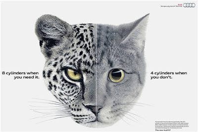
This advertising campaign created by BBH agency in London, has recently been one of the most successful communication advertising pieces i've seen. The way the message has been visually simplified delivering the benefits of the s7 to viewers without using and image of a car makes this communication different. The use of animals to represent the two different speeds this car can achieve, amplifies the power of the car. The use of white space, colour choices, and layout are done in a highly sophisticated way reflecting the style of Audi. I believe this communication has adopted the same qualities that Helmut Krone used, by delivering a clear message in a simplified way with the use of white space and design hierarchy. The use of white space helps put all focus on the visual image for viewers to decode the message. then the message is elaborated in typography to help reinforce the message and benefits of the Audi s7.
By advertising for such a well known brand BBH agency knew people would recognise the brand by just the logo, which has given them the freedom to create a clear message in an unconventional way. The design is done with such clarity, delivering a simple message, in a different way. Overall I've learnt it's about getting rid of the obvious pieces of an idea, and stripping it down to the minimum making it different, then adding a powerful clear meaning, that will captivate the viewers attention delivering memorable messages and gaining an emotional response.
'Simple but Different'


No comments:
Post a Comment