“Make it simple. Make it memorable. Make it inviting to look at. Make it fun to read”
Leo Burnett, advertising executive
Information design is a way of communication to inform. It's problem solving how to make information easier for viewers to digest and understand. By simplifying information and eliminating the unnecessary, can help make an information design successful. The use of visuals, typography, colour, layout, and structure are all essential parts that contribute in creating a successful information design. If these elements are executed in a successful way to viewers, they will be enticed to read the message, due to it being simplified in a creative way that attracts viewers.
http://www.grundini.com/#!/project/the-g2-graphic/pets-6708116187
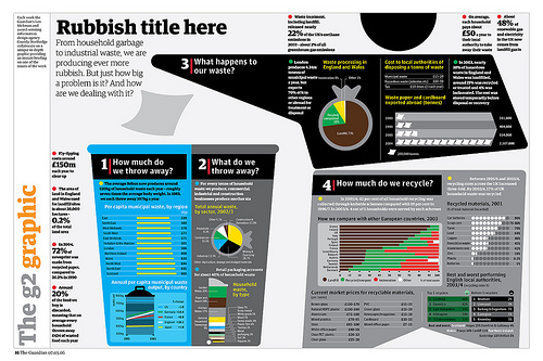
Information design can be any form of communication that's designed to inform, here is an example of an infographic by Peter Grundy. In this particular infographic Peter Grundy has designed to inform viewers about recycling for the Guardian. The creative experiments and explores different ways of communicating information in a simplified way. Visual imagery is used to represent what the piece of communication is about for viewers to understand. The use of creative graphs and bar charts are used to simplify information and statistics in a much more creative way, and prevents having columns of text. The visuals being created in such a clean cut way helps make the image clear of what it's representing. The use of colour helps make certain parts of the information more eye-catching, by having colour well balanced across the whole of the infographic, helps entice viewers to read all parts of the infographic. In all of Peter Grundy's work he has developed a consistent style by the way he illustrates his visuals, helping create a strong identity of his work.

http://www.coroflot.com/holley_codner/type-posters
Typography is also a crucial element when creating information design. Neville Brody is profoundly known for using the typeface 'Insignia' that he created. The typeface has adopted aesthetics of Art Deco, that has been given a modern twist. The legibility of a typeface is essential, as it helps viewers read the information clearer, by having such a bold clean cut type face, Insignia is widely used to communicate information due to being so legible. The use of grid structure and columns are consistently used to help break down text so it's easier to digest. The use of white space and colour in this particular visual helps create a visual hierarchy, making you read information in a particular order.
Overall, the use of researching into information design I found most useful, as this helped me remind myself of all the different elements you can use to inform people in a creative way. I will explore all elements in the future, when i'm designing to inform, to help me create the most effective communication piece thats full of creativity.
No comments:
Post a Comment